NOTE: Each image is clickable for a MUCH LARGER version that shows greater detail.


| Scarface Original/Repro
Comparison NOTE: Each image is clickable for a MUCH LARGER version that shows greater detail. |
|
| Here you can see the full posters of the repro and original side-by-side. The original is at right. |
|
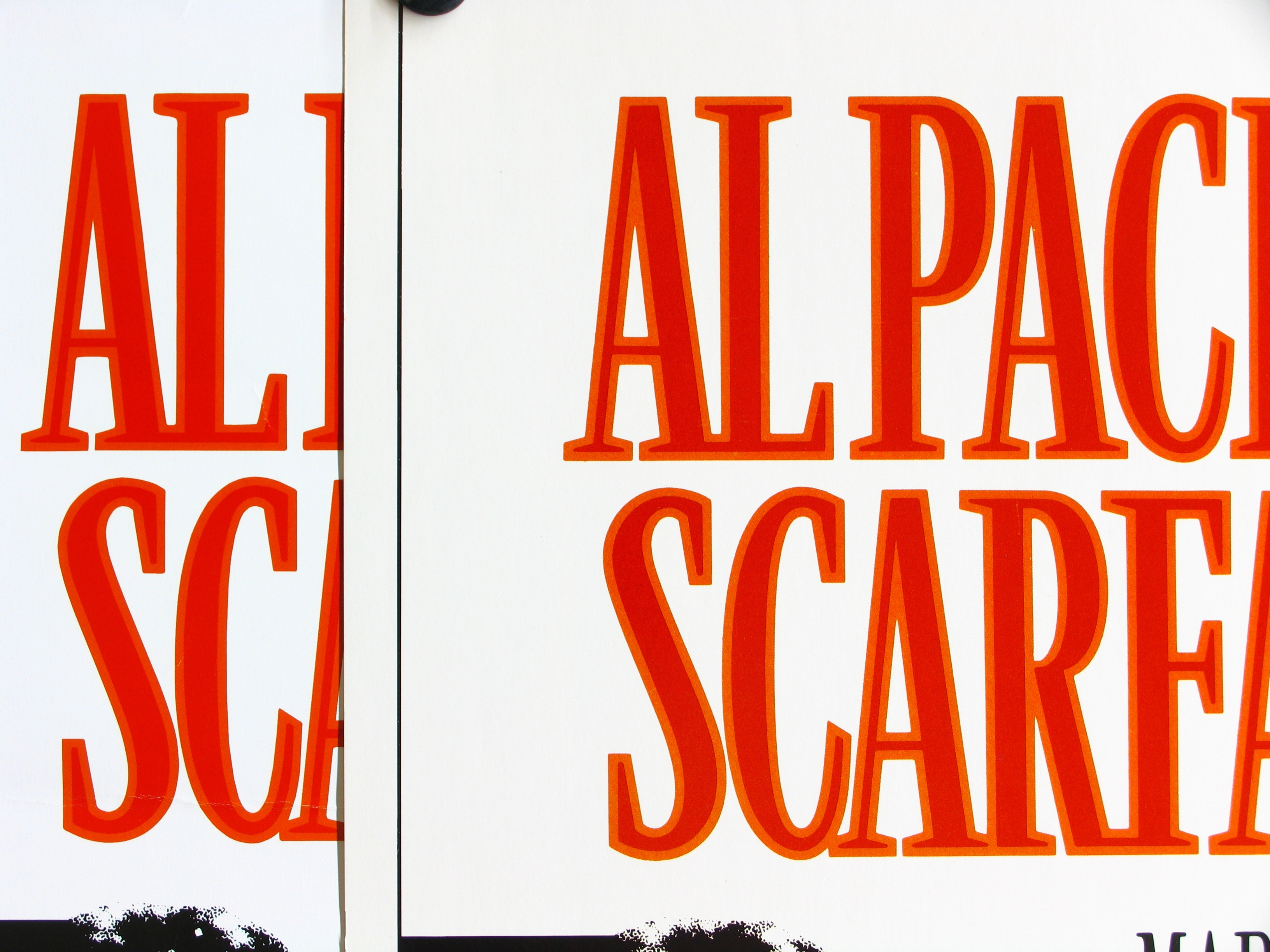
| Here you can see the clearest differences between the original and reproduction. The color differences in the red of the title area are dramatic. The original is at right. |
|
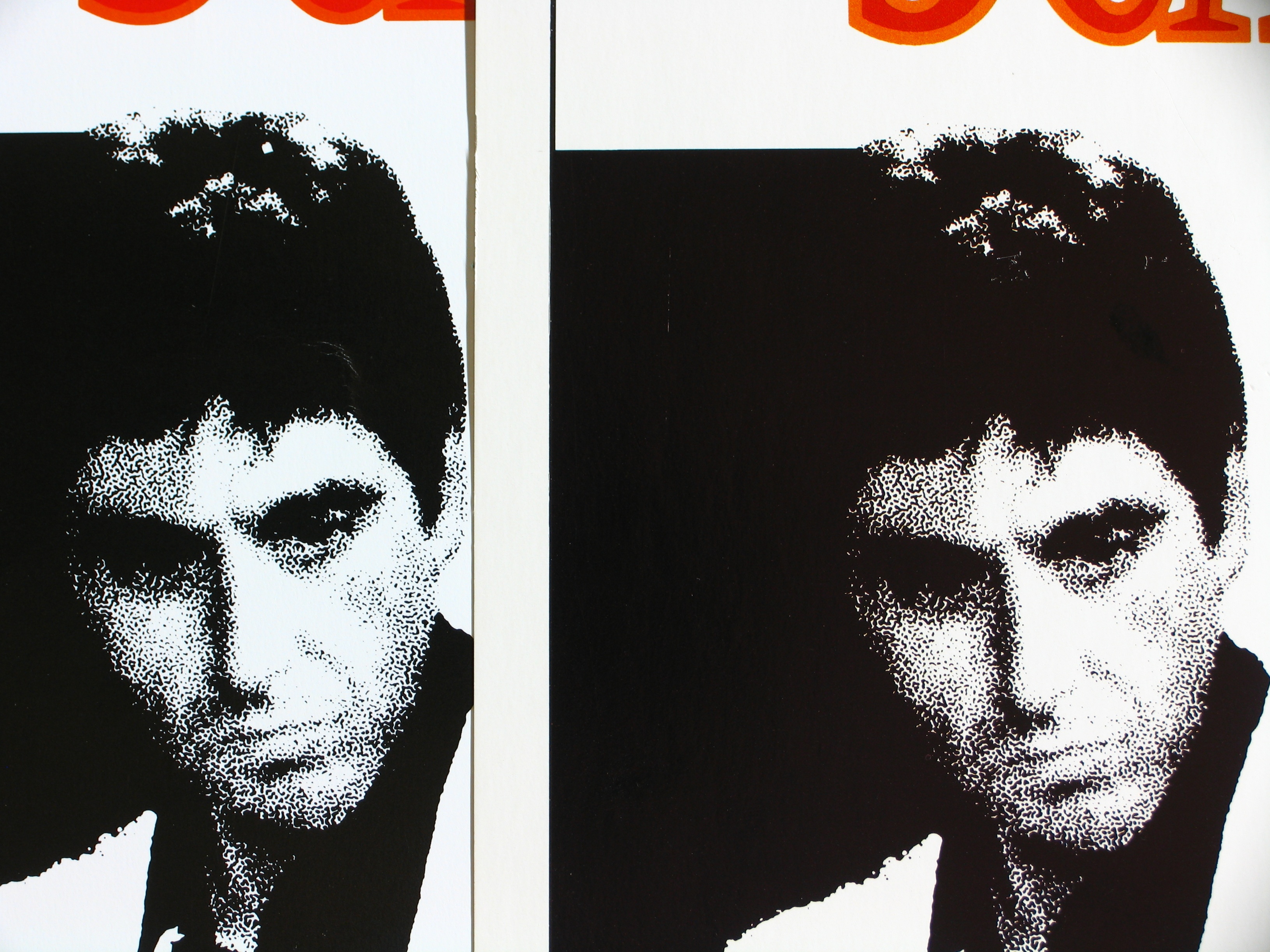
| Here it is difficult to discern the color differences, but the original has different blacks for the keyline (around the edge of the poster) and the black in and next to Pacino's image. On the repro, both blacks are identical, but on the original, once can tell a subtle difference. The original is at right. |
|
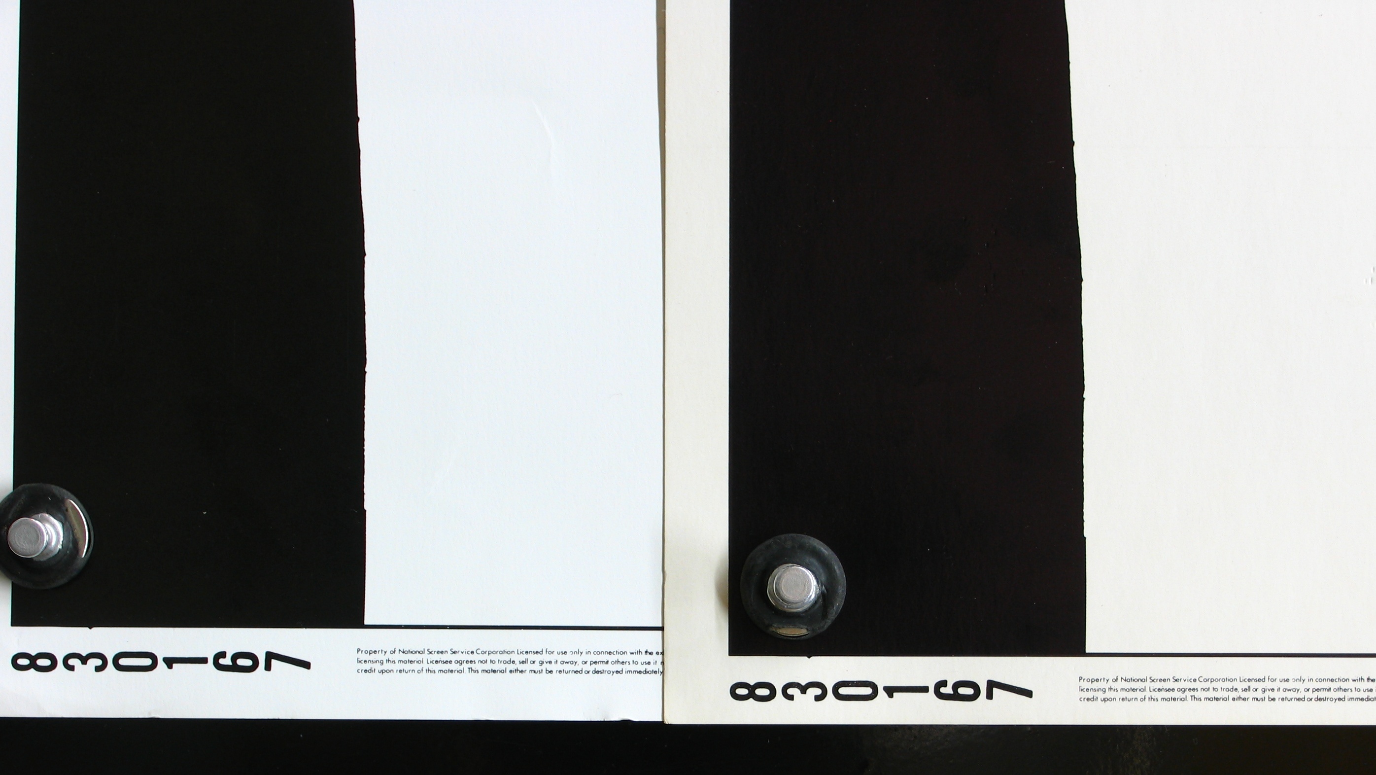
| Same as the above. The original is at right. |
|
| Same as the above. The original is at right. |
|
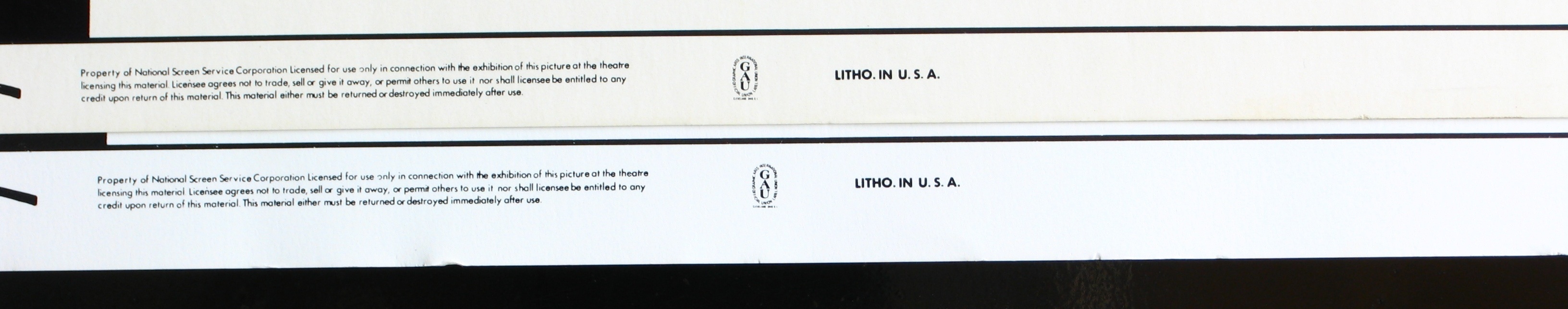
| We are supplying this GAU photo to show that it is very difficult to draw conclusions just from the GAU logo. Below is a scan of the GAU area. In both, the top poster is the original. |
|
|
|
|